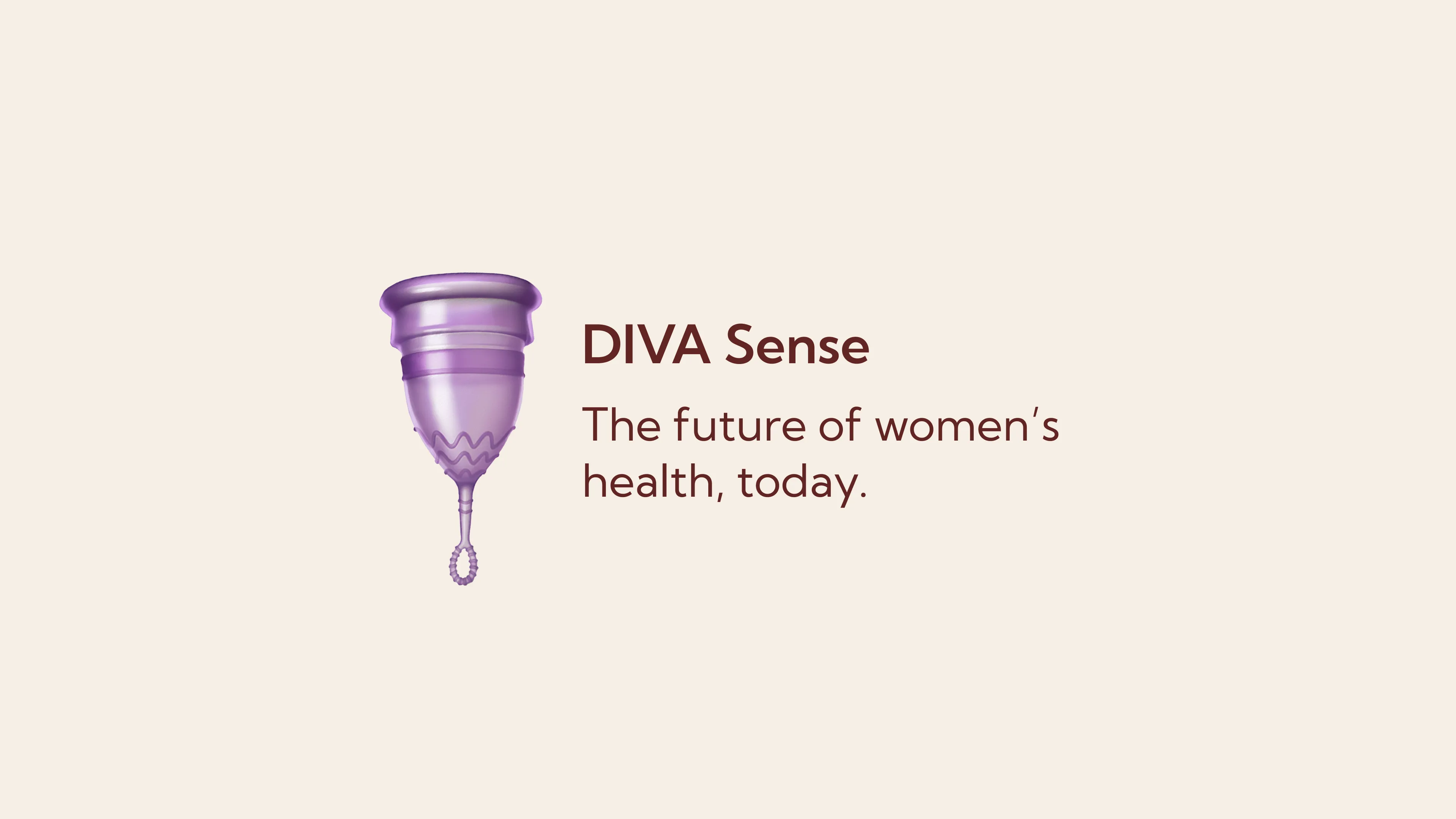
Diva Cup Product Design
Get familiar with the project
The client for this project was DIVA. This was a product design based on an existing product the company sells, that works in hand with a newly designed app interface. The objective was to improve the existing products functionality and design.
DIVA is a Canadian menstrual care and cycle wellness company. They focus on menstrual care products that are designed for sustainability, comfort, and body-positive cycle support.
The Driving Factors
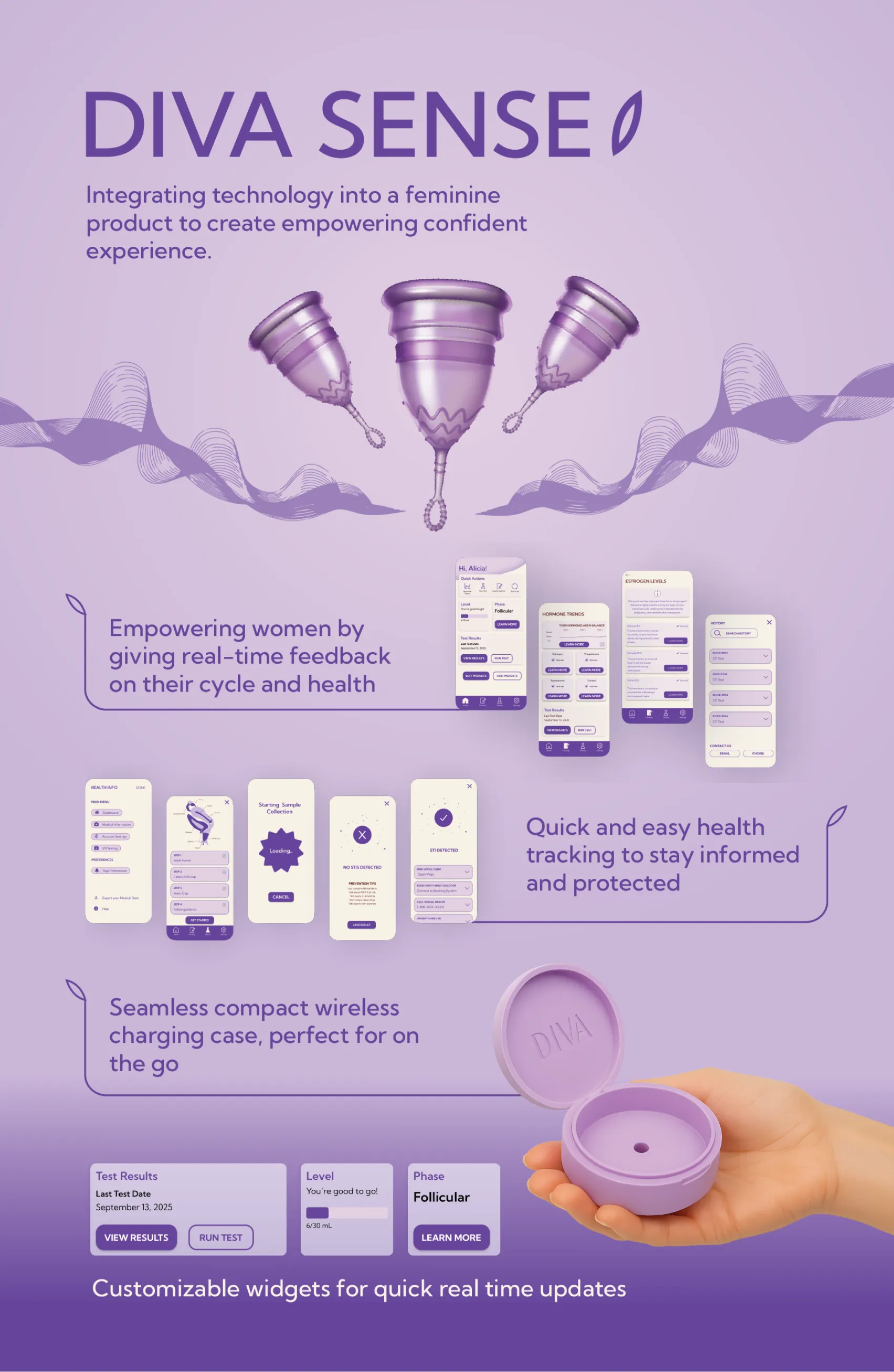
The goal was to improve the DIVA cup design, so it can benefit users on the go who need a product that is quick to use. The design needed to be improved for faster, easier, and smoother insertion and removal. The goal was to not only improve the physical design for easier use, but to also eliminate feelings of embarrassment, since the original material needs to be boiled in hot water before it can be used. The last goal was to introduce the interconnection of the product to an app. The goal of the app is to give the user real time updates regarding all aspects of their cycle and hormones.
Motivations:
- Lack of accessible hormonal and cycle information for women.
- Pain points with the comfortability of using the DIVA cup itself.
Deep Dive into DIVA
Research was at the forefront of this project. Having a deep understanding of DIVA’s business allowed us to gain insight into their motivations, approach, and existing products. The first step was determining the existing issues with their product and figuring out what the goals were.
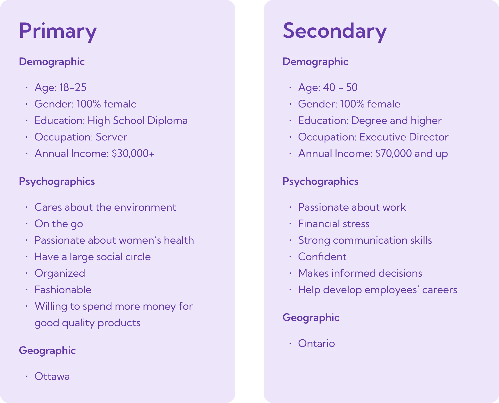
After gathering background research regarding the existing product and determining the problems, the next step was to narrow in on who the target market was and what their needs are. We looked at the primary and secondary target market and determined the psychographics, demographics, and geographics.
Key Insights:
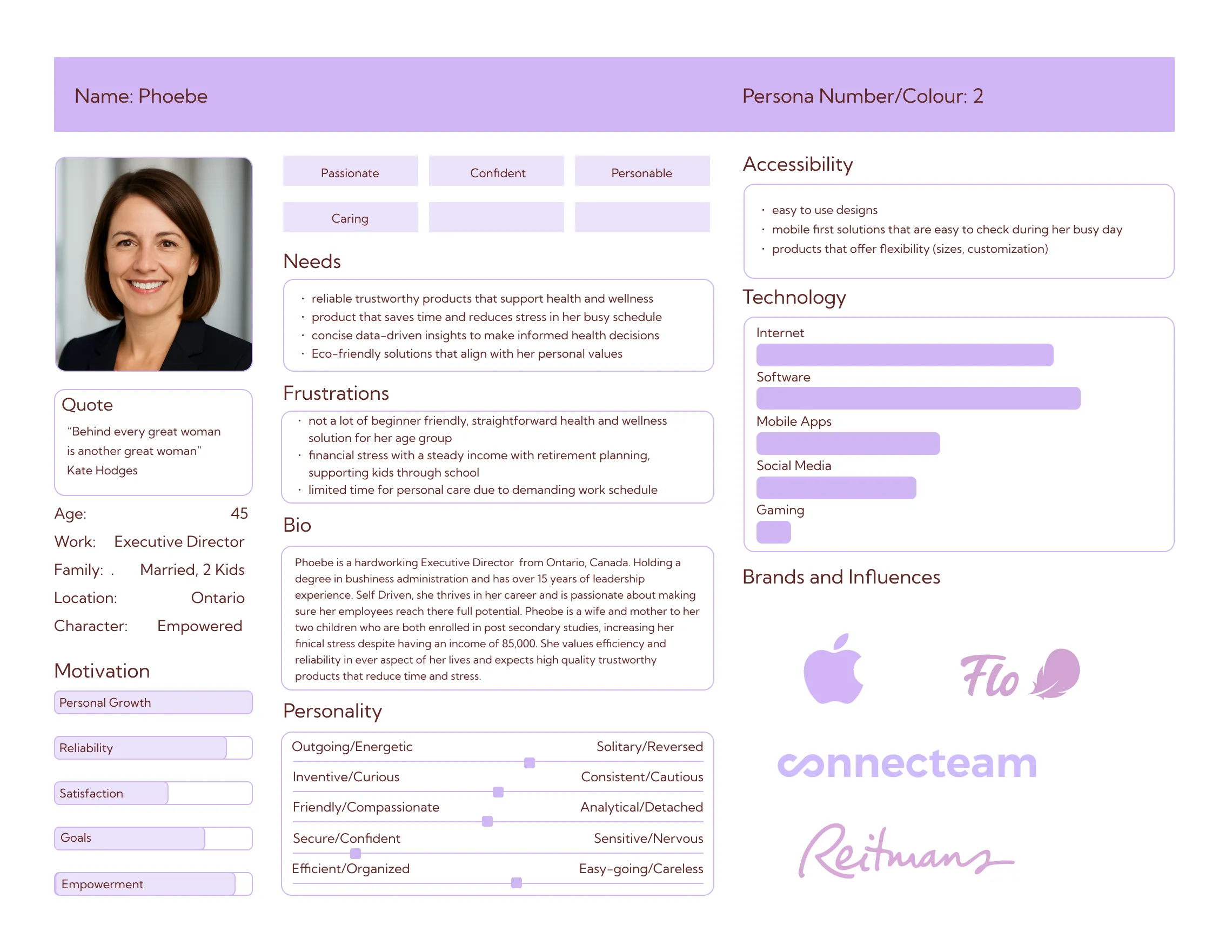
- Primary Market: Women aged 18-25, Busy lifestyle, passionate about women's health.
- Secondary Market: Women ages 40-50, passionate about work, struggling to balance and understand their hormones.
All About the Users
The initial research set us up to create personas using our user needs, product analysis, and market analysis. The personas were an important part of this process because it allowed us to be able to visually dive into the pain points, behaviour, and needs of our target market. Alongside the user personas were their statements. These statements were a guide to our design focus for improving the product and the user experience.
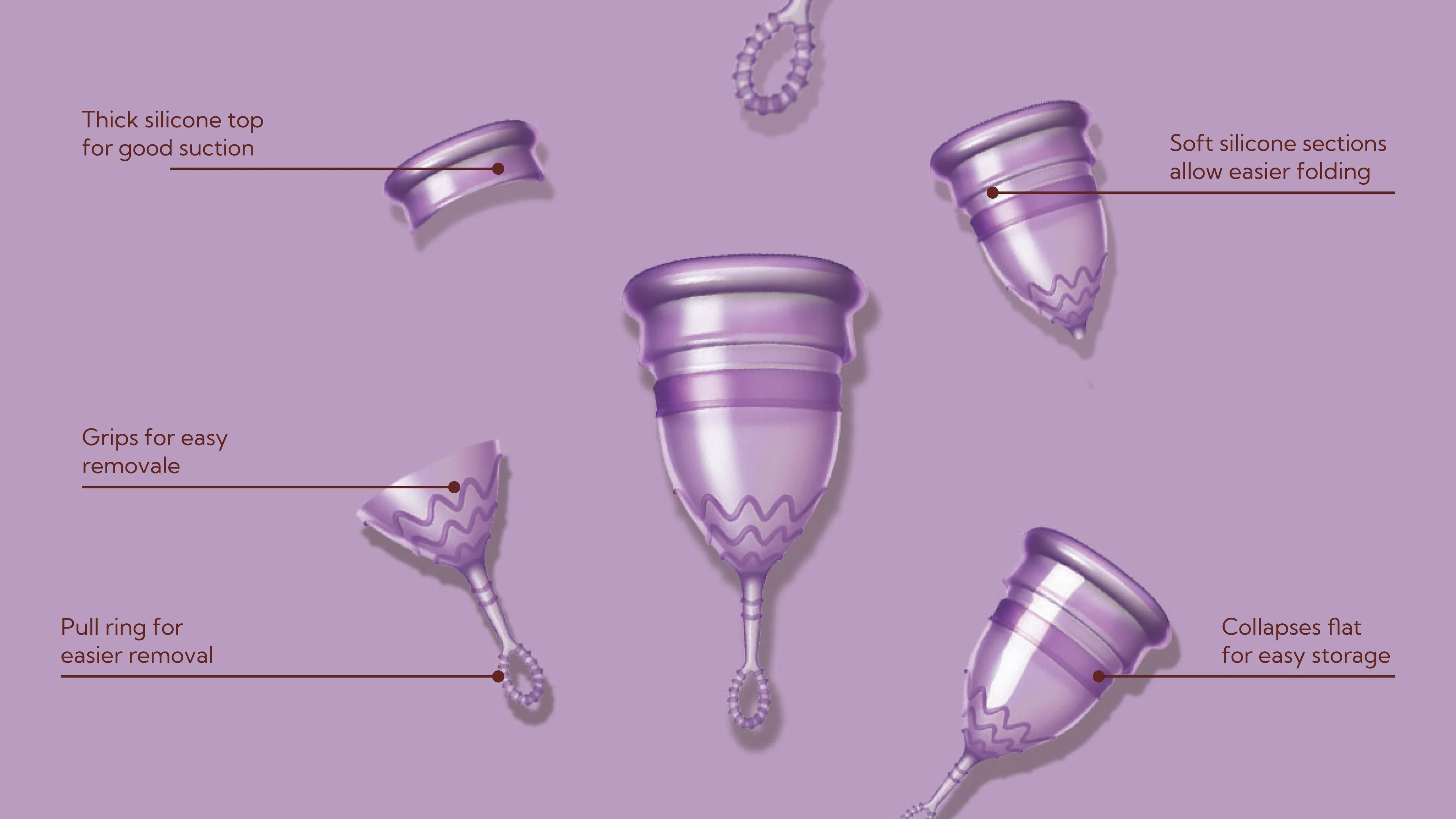
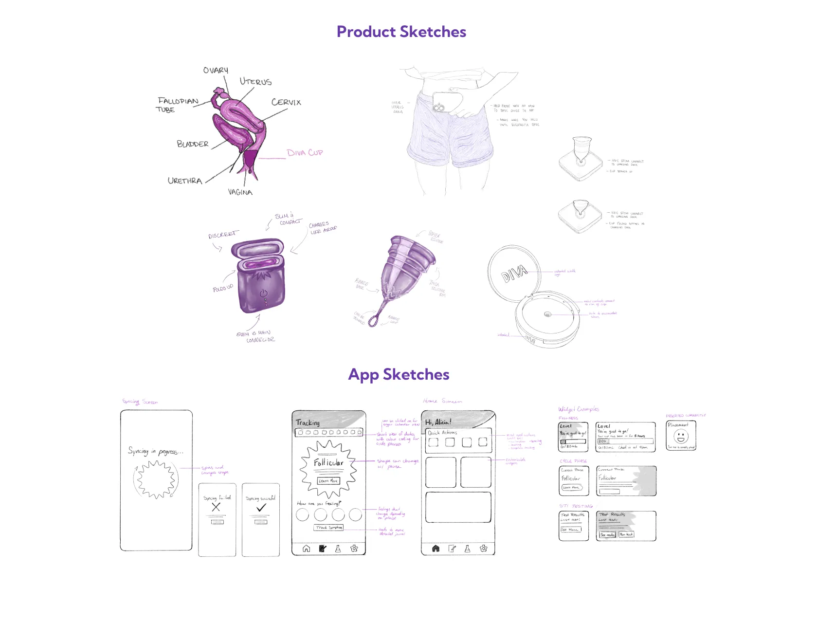
After the initial background research, it was time to focus on the improvements of the physical DIVA cup. This stage included sketches of the implemented improvements, which were a change in material, addition of ribbing, a change in stem shape, and a thicker top rim. These changes are all to improve the user experience. Each group member created sketches of the new product, the charging device, the device in use, app screens, and the synching of the device.


The Design Choices
To create the look and feel a mood board and style guide was created. This determined the design choices that would be applied to the product and app design moving forward. We decided to keep with DIVA’s branding for consistency in the design and to keep brand recognition.
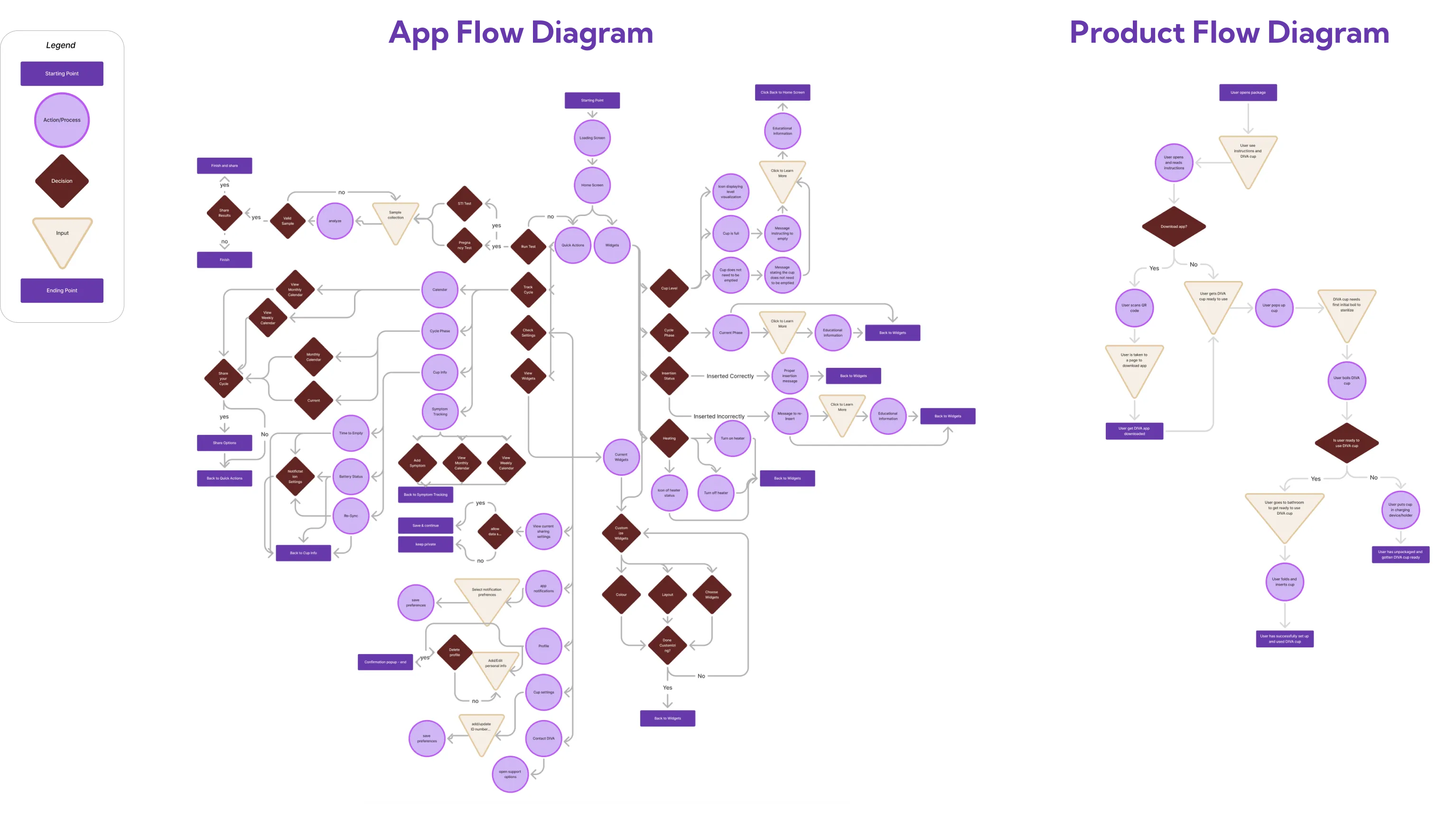
Planning the App
Circling back to our personas, we created journey diagrams to see how the user experience would be with our proposed improvements and with the new app integrated. To move forward with the design of our app, flow diagrams were created for each proposed screens. This laid out how each screen works and the content they included.
The Final Solution
The final product and app design targeted pain points including difficulties during use, lack of technology integration, and feelings of embarrassment due to material requirements, and the lack of accessible hormone and cycle information. The new design of the product has been adapted for quicker use, by making insertion and removal easier, it has a new material that eliminates the need for the cup to be boiled, so users who live with others don't have to take the cup into a communal space. The app synchs up with the product to provide real-time updates of relevant hormonal and cycle information. The information is presented in a structured easy to follow layout, so the information is easy to digest.