Ottawa Distillery Re-brand
Get familiar with the project
The client for this project was North of 7 Distillery. This was a full logo re-brand using the Adobe Suite to complete the project. The objective was to find a locally owned business in need of a logo rebrand.
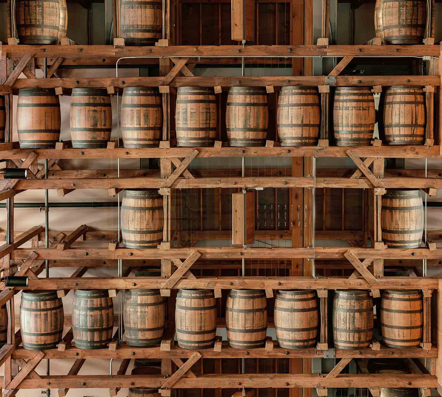
North of 7 Distillery is located just outside of downtown Ottawa. They pride themselves on their quality grain-to-glass production that is filled with creating not only a product, but an experience for the consumer. The rebrand needed to balance the core values of the brand, while also communicating what they do as a business.
The Driving Factors
The goals for this rebrand were to create a balanced logo that not only conveys their core values as a brand, but also represents what their business actually does. The brand needed a logo that shows who they are and what their unique selling point is.
Motivations:
- Brand confusion created by existing logo.
- Lack of brand values and USP in existing logo.
Digging into Distilling
A logo rebrand requires a strong foundation. To understand the brand and its core values, I began researching the origins of the business and who the owners were as people to see what motivated them. I then looked into the products they sell and how they market them. This gave me a good idea of how established their brand identity already was.
To get an understanding of what goes into their products I researched the distilling process, the machines used, and importance of product. This helped me narrow down the most important aspects of distilling and elements that I should pull from for the design. Making a creative brief was key to determining the key aspects of this brand and their design goals.
Key Insights:
- Primary audience: Local Ottawa residents, craft spirit enthusiasts, men and women ages 30-60.
- Secondary audience: Online buyers or Ottawa visitors and Bars and restaurants looking to carry unique spirits.
Starting the process
After going through the research process I began putting my ideas onto paper. This gave me a good base to begin narrowing down the direction for the design. I brainstormed different aspects of distilling. The feelings, elements, and social aspects that were apart of the industry.
Preliminary sketches helped visualize the mind map I had created. They laid out a solid base to see what initial ideas could be workable and which ones were not. Thinking about ways to incorporate elements of the business such as the name, the distilling process, and the background origins were at the fore front of this ideation phase.


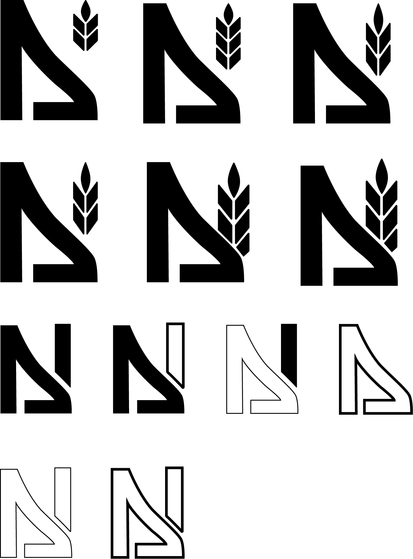
Refining concepts
The third round of sketches is what determined the final concept. This is where I saw an opportunity to combine elements from two concepts to create a new design that has a balance of what the business is and what their unique selling point is.
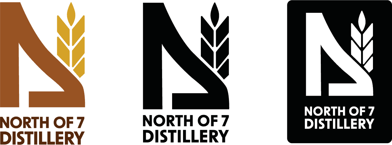
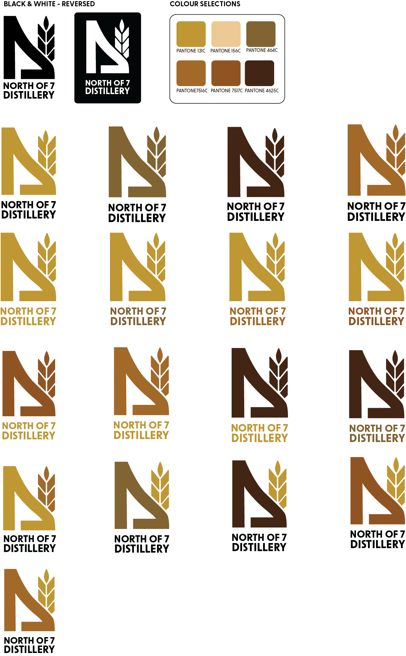
The final concept is made up of two main elements. The first element is the wheat symbol. This represents their unique selling point and their core values. The business prides themselves on their quality product and grain-to-glass distilling process. The second element is a simplified part of a distilling apparatus. This communicates that this business is a distillery. I wanted to have this element so that the symbol not only had the wheat to represent the values, but to also have the apparatus to represent what this company actually does.
The combination of the elements intentionally fit together to create the shape of an N. This is to further connect the symbol to the business, since it's called North of 7 Distillery. If you look closely the distilling apparatus also forms the shape of a 7 upside down. These are all small details that come together to create a balanced logo design that represents the business as a whole.
Bringing the Concept to Life
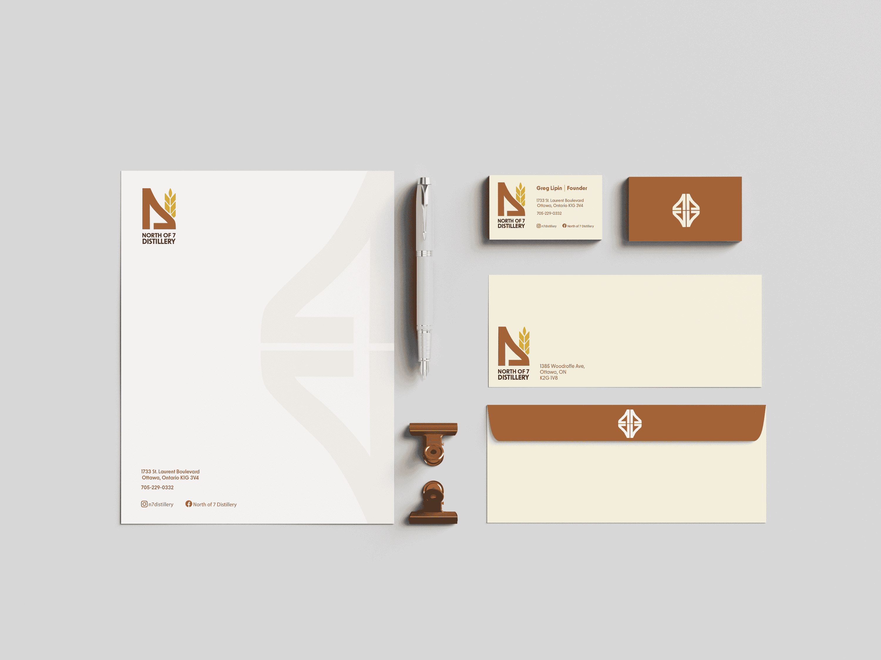
After refining the final concept, it was time to bring it to life with colour. After creating more colour combinations with this logo than I'd like to admit, I determined an appropriate palette that was not only visually appealing, but also helped further communicate the intended messaging.
The colour palette is a combination of warm, earthy, and rustic tones to play off the feeling and tone you would find in a distillery and the distilling process.
The Final Brand
The outcome of this project was a new logo that represents the North of 7 Distillery business and the values it encompasses. This project required strengthening the ability to find a balance in design elements, while staying focused on the brand goal. This project showed that versatility and structure is key in creating a successful logo.
.png)